UX Design
2025
Turning raw data into meaningful decisions.

client

Jint.

Timeline

4 months · 2025

Role

Product Designer

01
Overview
Jint is a B2B intranet platform used by organisations to manage internal communications and employee engagement. Its analytics dashboard existed from day one — but nobody used it. The data was there; the meaning wasn't. The goal was redesigning the dashboard from the ground up, turning raw numbers into clear, actionable insights for both Jint's own Customer Success team and the admins and communication managers on the client side.
Problem
An existing dashboard no one used — data was incomprehensible and impossible to filter by site or date.
Target users
CSMs at Jint · Admins, Communication & HR Managers on the client side.
Outcome
Spontaneous adoption by internal teams and clients alike — unsolicited thanks from collaborators across the board.
02
Problem
The analytics dashboard had been live for a while, but it was virtually invisible in day-to-day use. Feedback from clients and internal Customer Success Managers painted a consistent picture: the data shown was hard to read, context was missing, and there was no way to narrow results by site or time period. For CSMs trying to guide clients through licence renewals or low-engagement situations, the dashboard offered no actionable foothold.
What users said
Clients couldn't understand what the numbers referred to. Without date or site filters, data felt global and abstract — impossible to act on or share with a manager.
What the business needed
CSMs needed to spot low-engagement clients proactively and trigger licence renewal conversations at the right moment — not after the contract had lapsed.
How might we make complex platform data instantly readable — for both the teams selling Jint and the administrators managing it?
User need
Understand what the data means at a glance, without having to ask someone.
Design challenge
Bring clarity to a dense, multi-metric dashboard used by very different profiles — from technical admins to HR managers.
Business goal
Reduce churn risk by making licence consumption visible in context, with a timely renewal prompt.
03
Process
With a tight four-month timeline, I structured the project around two rounds of Maze testing — one internal, one with real clients — to validate decisions early and avoid late-stage rework. Research and ideation ran in parallel with ongoing feedback loops through Harvestr and Notion.
1.
Research & Audit
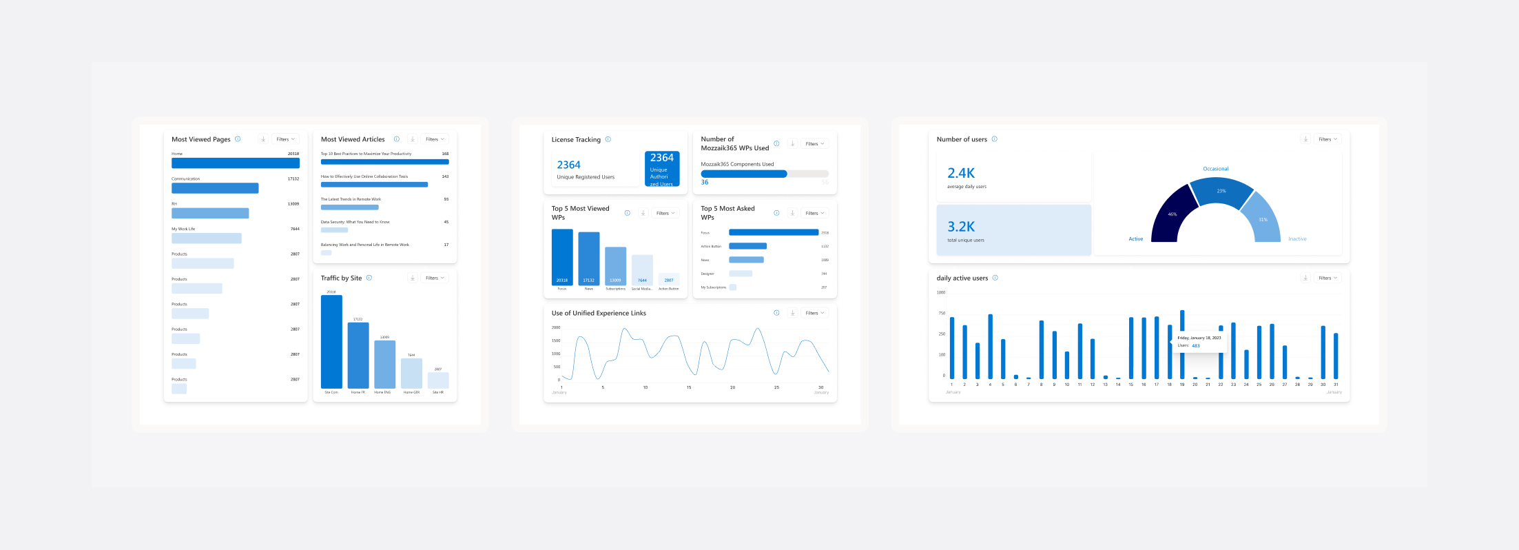
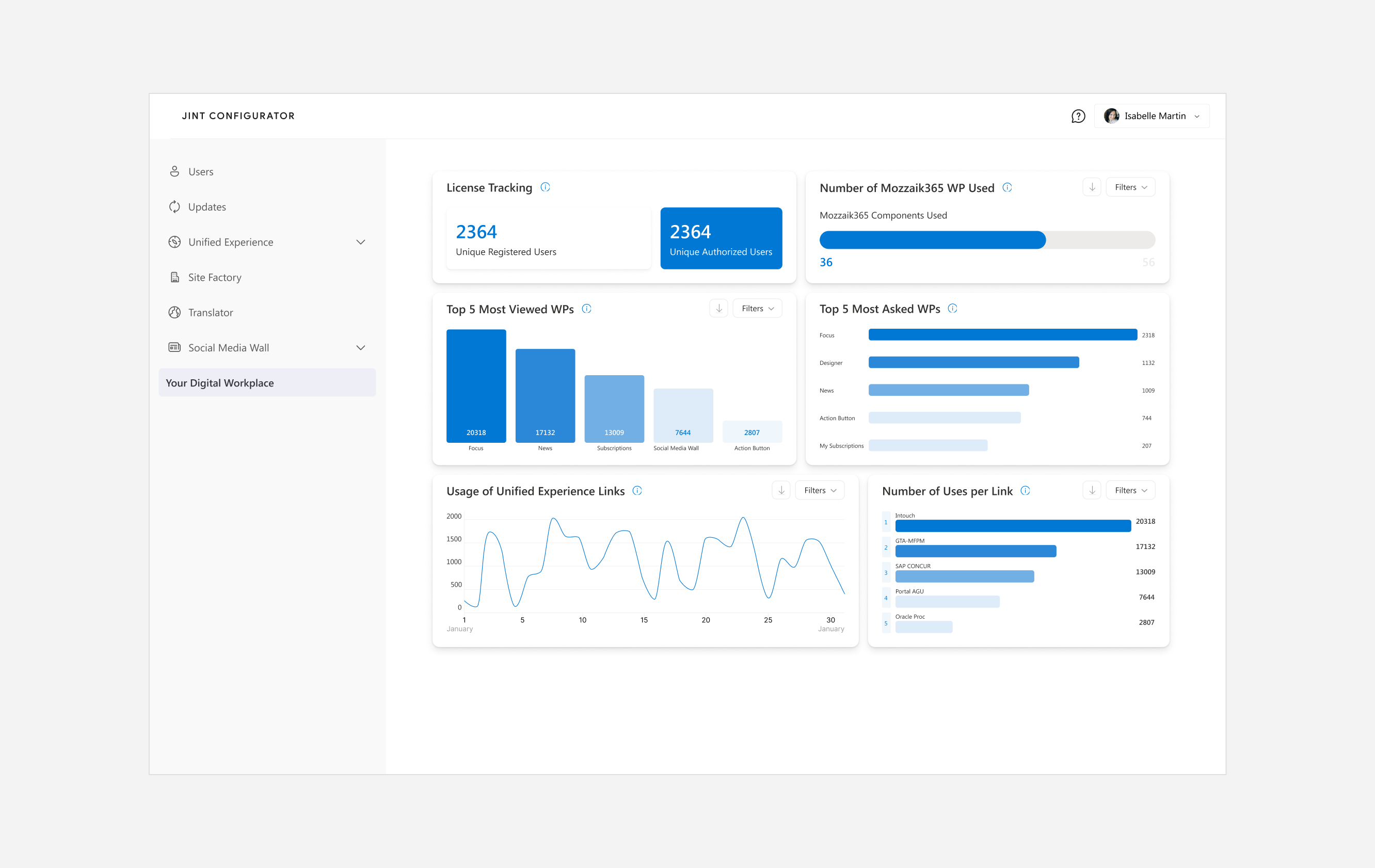
I started by auditing the existing dashboard with CSMs, mapping every metric displayed against what users actually needed to know. Most of the data was technically correct but contextually meaningless — no labels explaining what a "unique user" meant in the Jint context, no way to filter, no visual hierarchy to guide the eye. I also reviewed client feedback collected through Harvestr to identify recurring pain points.
2.
Define & Structure
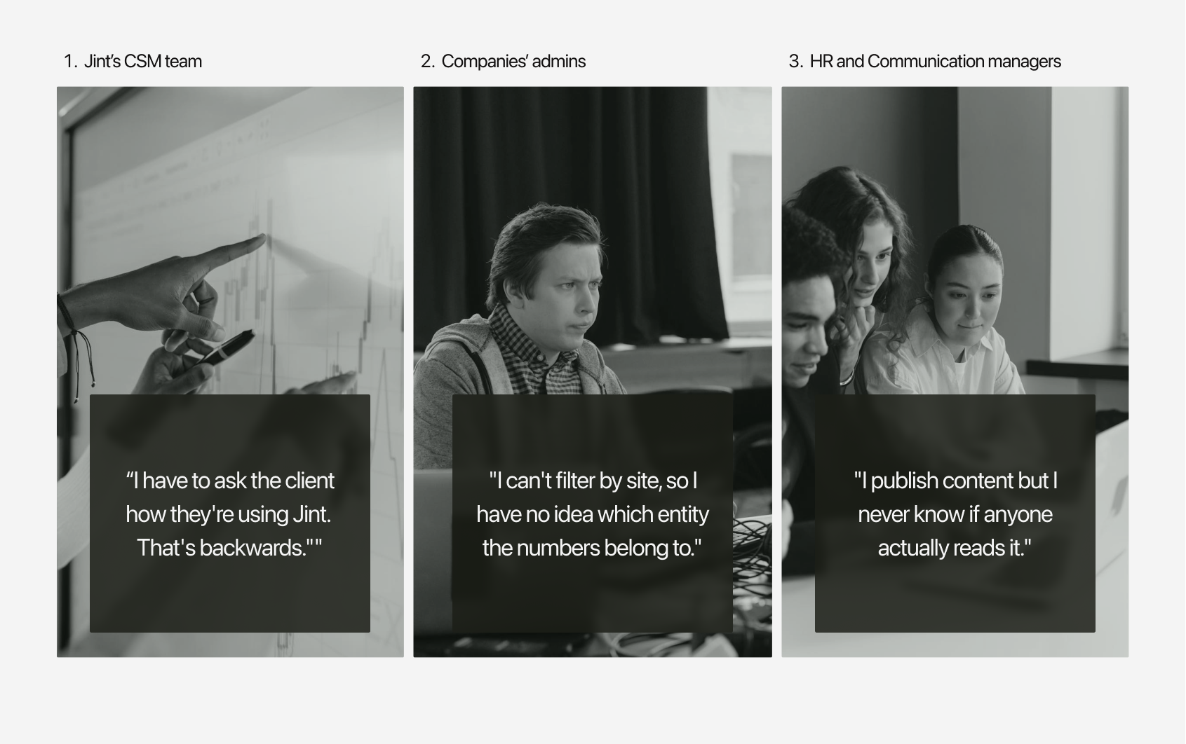
I mapped the three user profiles and their distinct goals: CSMs needed a bird's-eye view of client engagement to prompt action; client admins needed site-level granularity to report upward; HR and communication managers needed to understand content reach without technical jargon.
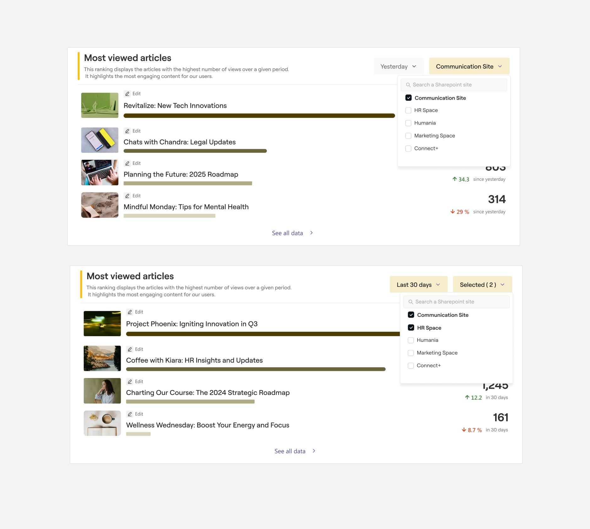
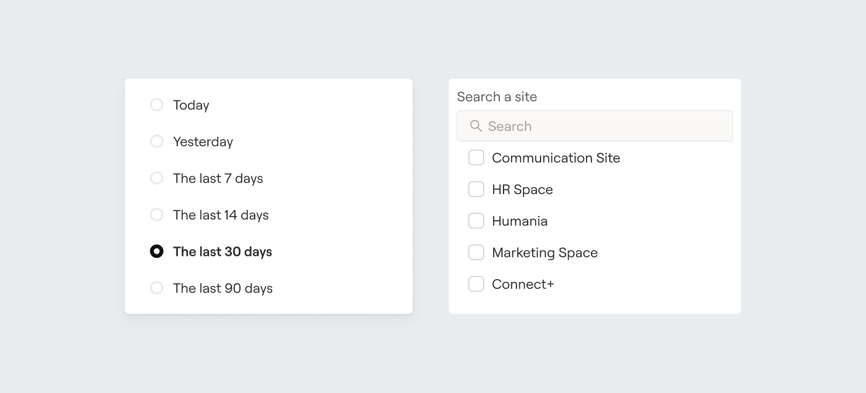
This shaped the information hierarchy and filter logic — date range and site became the two primary axes of control.
3.
Design & Storytelling
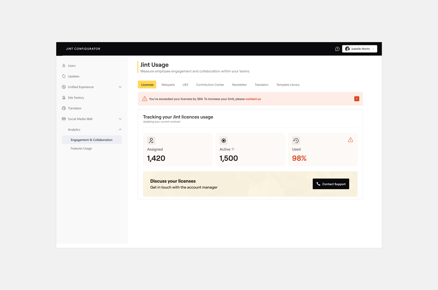
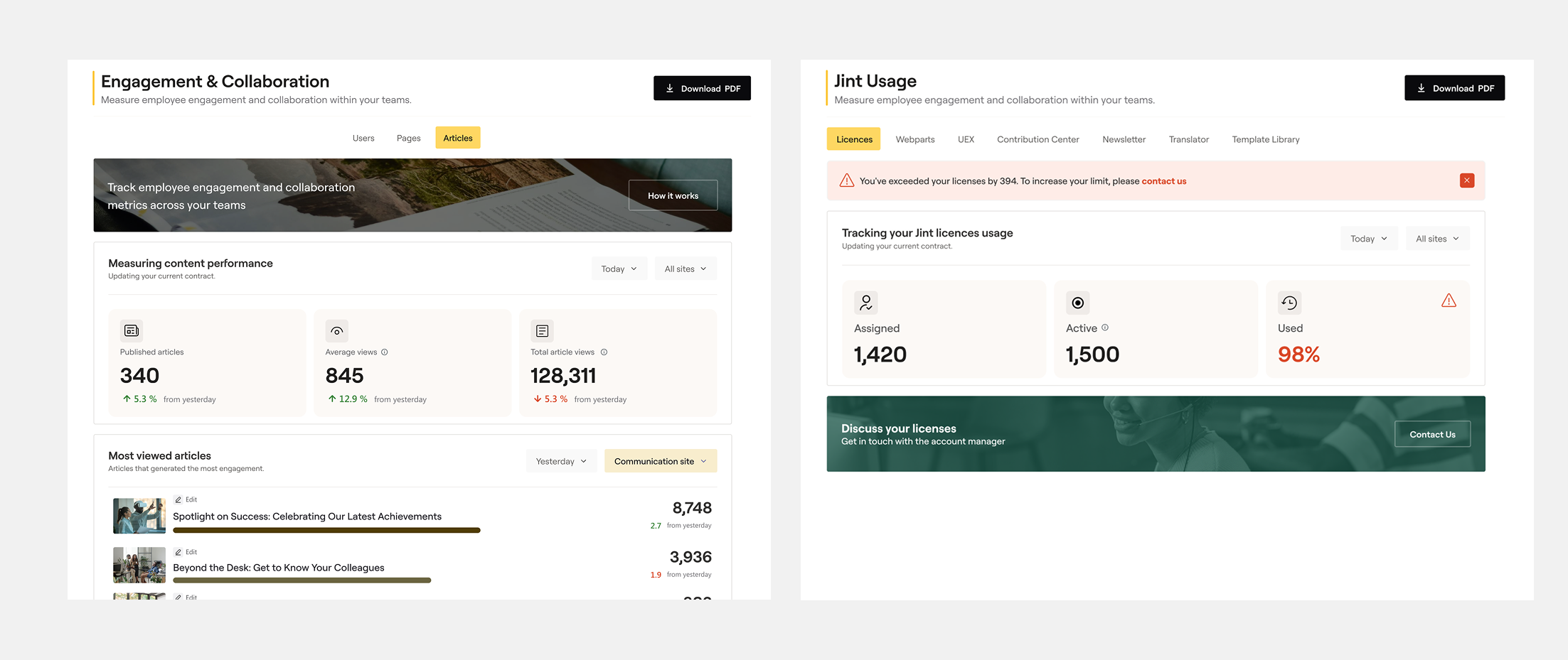
Rather than presenting raw figures, I introduced a storytelling layer: descriptive subtitles under each metric (explaining what it measures and why it matters), contextual tooltips on hover, and a clear colour and typographic hierarchy to separate primary KPIs from supporting data. The licence consumption widget was elevated to a prominent position, with a contextual renewal banner appearing when a threshold was reached — integrated into the data flow rather than bolted on as a generic CTA.
4.
Internal Testing (Maze)
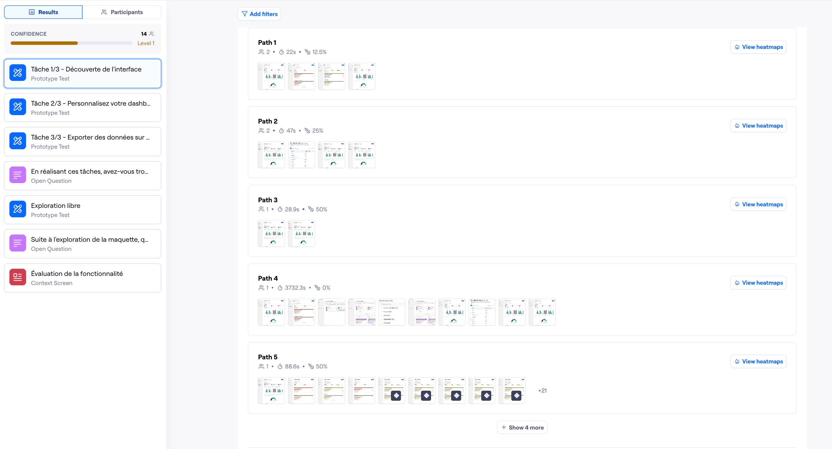
The first Maze test ran with internal collaborators — members of the Jint team who would use the dashboard daily. Tasks focused on three things: finding a specific metric, understanding what a data point meant, and judging the overall usefulness of the dashboard. Findings from this round led to adjustments in label wording and the positioning of the filter controls.
5.
External Testing (Clients)
The second round extended the test to five real clients over one month — a deliberate decision to validate with the people who would actually live with the dashboard. This phase surfaced one key insight: client admins needed even more explicit site-level labelling, since their organisations often ran Jint across multiple entities with distinct teams. A final iteration tightened the filter UI and added clearer site identifiers throughout.
04
Solution
The redesigned dashboard makes Jint's data legible at a glance — for a CSM scanning a client account, an admin preparing a monthly report, or a communication manager checking content reach. Every design decision prioritised context over volume: less data shown better, rather than more data shown poorly.
Feature 1
Filters by date & site
Users can now narrow any metric to a specific time range and organisational site. For multi-entity clients, this transforms the dashboard from a global overview no one trusts into a precise reporting tool that maps to their actual structure.
Feature 2
Data storytelling layer
Every metric now carries a subtitle explaining what it measures and why it matters, alongside a hover tooltip for deeper context. A deliberate colour and typographic hierarchy guides the eye from primary KPIs to supporting figures — removing the cognitive load of interpreting raw numbers.
Feature 3
Contextual licence renewal prompt
Rather than a static CTA buried in a sidebar, the renewal prompt appears as a contextual banner when licence consumption crosses a defined threshold — surfacing at exactly the right moment in the data flow. For CSMs, this turns the dashboard into a proactive account management tool, not just a reporting view.
Feature 4
Granular engagement metrics
The dashboard tracks unique users, article views, webpart usage, module adoption, and user distribution across sites — all in a single view. Each data point is scoped to the selected filters, giving admins the granularity they need to understand not just how many people use Jint, but how and where.
05
Impact
The redesigned analytics dashboard went from a feature nobody opened to one that colleagues actively referenced and clients brought up in CSM calls. The impact was qualitative but immediate — and rare in its breadth: it reached both the internal team and the client side simultaneously.
Learnings
Data literacy varies enormously across user profiles — designing for the least technical user raises the experience for everyone without losing depth for power users.
Running Maze tests in two distinct phases (internal first, then real clients) gave me the confidence to ship with meaningful validation rather than assumption.
A well-placed, contextual CTA outperforms a persistent one — integrating the licence renewal prompt into the data flow made it feel useful, not pushy.
Next project
OpenHive