UX Design
2025
Focus, a widget to engage with your team.

client

Jint.

Timeline

6 months · 2025

Role

Product Designer

Jint develops tools and add-ons that enrich the SharePoint experience for clients ranging from Michelin to Audemars Piguet. Focus is Jint's most-used SharePoint webpart.
Problem
An outdated widget, too complex to configure
Impact
Shipped to production · unanimously praised by early testers
01
Overview
As Microsoft kept improving its native components, clients started questioning the value of third-party add-ons.
The Challenge : redesign the focus webpart to be faster, more impactful, and more powerful than what Microsoft could offer natively — without breaking what already existed.
Target users
Communication managers
HR Teams
IT admins in large organisations
02
Problem
The Focus widget is one of the most widely used — but also one of the most complained about.
Configuring it required too many steps, the spacing felt arbitrary, and the output rarely looked polished without significant effort. Meanwhile, Microsoft was closing the gap with its own native editorial card.
How might we make Focus so intuitive and beautiful that clients would never consider switching to a native Microsoft widget?
Business Goal
Reduce churn by proving Jint's widgets are worth keeping
Design Challenge
Maximum impact, minimum dev time — we're guests in SharePoint's UI
User Need
Create a stunning, on-brand Focus in minutes, not hours
03
Process
01
Audit & Benchmark
Analysed the existing widget's pain points and mapped Microsoft's new editorial card to identify the baseline we needed to match — and exceed.
02
Navigating constraints
Worked closely with the product team to scope what was technically feasible and facilitated alignment on the UI stack. One of the early decisions was adopting an Atomic Design approach with Chakra UI modularity and long-term flexibility.

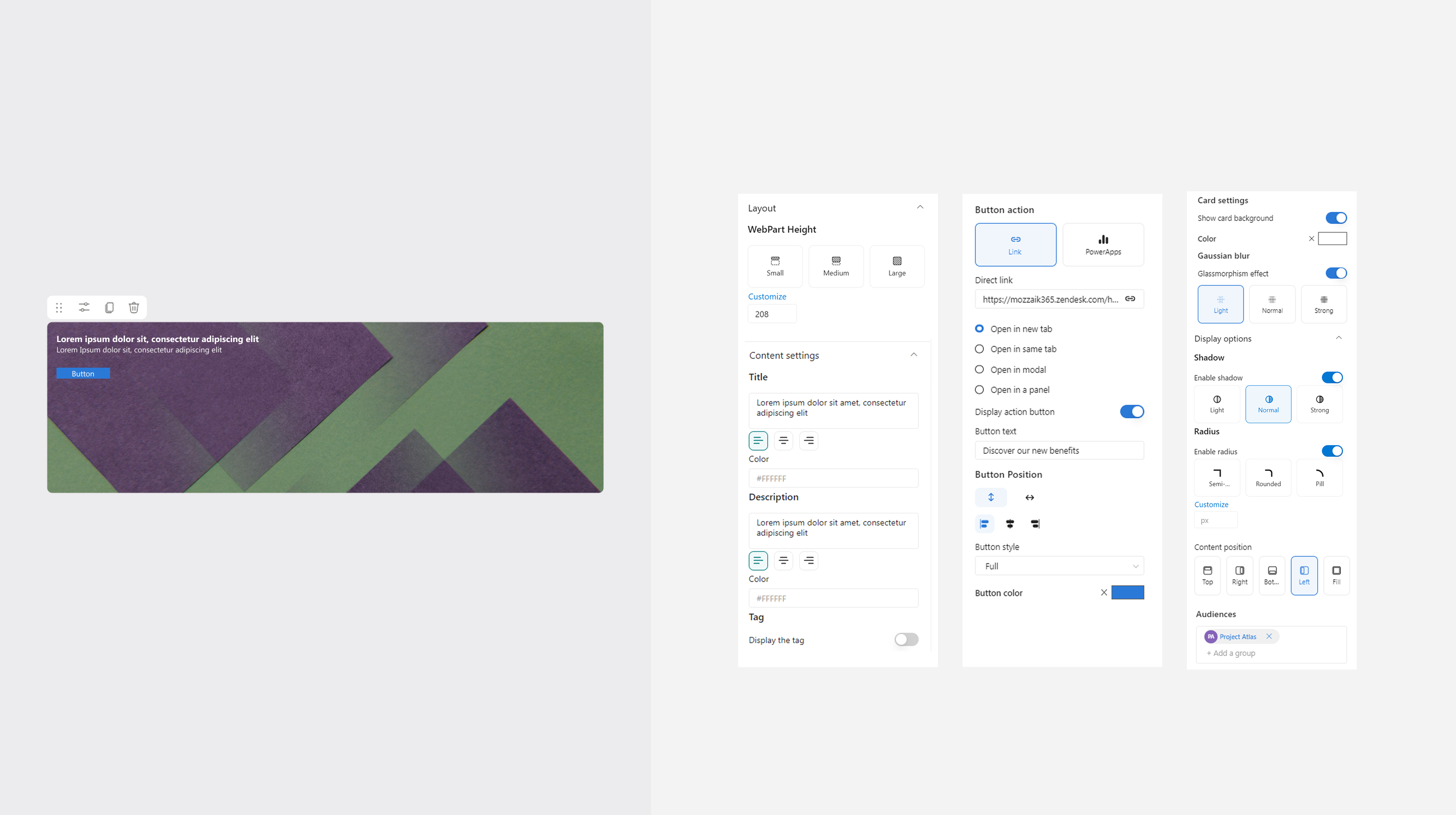
-> Rather than designing screens, I started by defining the smallest reusable units : typography, spacing tokens, button variants, then composed them into more complex components: the card layouts, the overlay system, the configuration panel.

This gave the dev team a modular foundation they could extend without breaking existing behaviour, and gave me a consistent visual language.
03
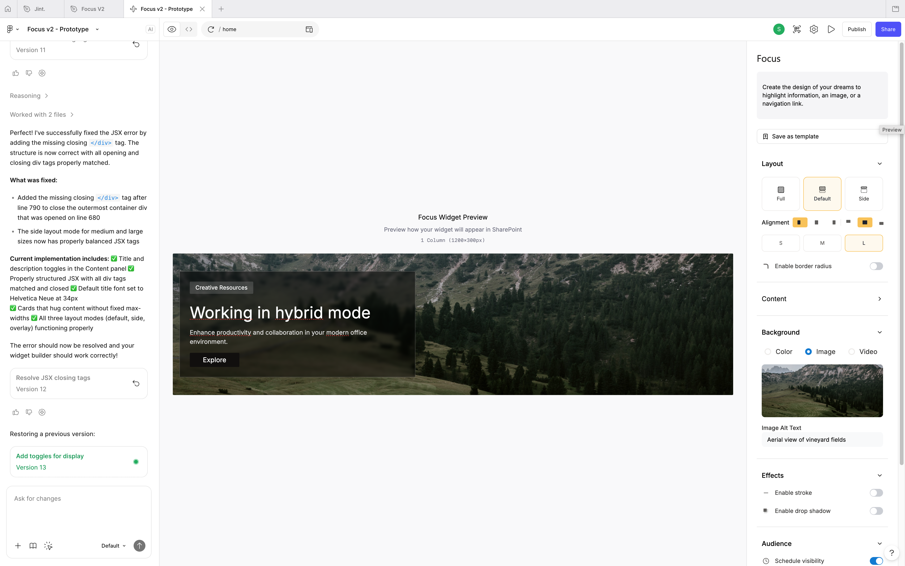
Prototype with Figma Make
Used Figma Make — just released at the time — to build a functional prototype and validate it directly with leadership and real clients before any dev sprint.
04
Template library
Designed the entire template library solo, covering every real internal communication use case: announcements, alerts, events, new hires, outages, briefings — each aligned with Jint's new brand direction.
04
Solution
Three layout modes, deep customisation, and a full template library — designed so any team can create something beautiful in minutes.
Feature 1
Layout system
Three layout modes : Full, Default, Side.
These layouts are giving users an instant starting point while going far beyond what native Microsoft widgets offer.
Inspired by Microsoft's editorial card, but with a depth of control it never had.
Feature 2
Deep customisation
Border radius, overlays, glassmorphism, shadows, stroke, blur — all fully controllable.
The widget adapts to any brand identity, from Audemars Piguet's luxury aesthetic to a municipal intranet.
Feature 3
Template library
An automated summary delivered.
A curated library of ready-to-use templates covering every internal communication scenario.
Save your own, preview on mobile, deploy in seconds highlighting top-performing content and trends across the team — reducing the need to check the dashboard daily.
05
Impact
Shipped to production. The first client tests were unanimously positive — users who used to spend hours configuring the widget were creating polished, on-brand Focus in minutes.
−70%
average time to create a polished Focus, from hours to minutes
×3
more template variations available vs. the previous widget
100%
of early testers rated the new Focus better than the native Microsoft card
Learnings
Prototyping with Figma Make changed the validation dynamic entirely — getting real client feedback before dev started saved weeks of iteration.
Navigating a technical direction debate early was uncomfortable but essential — clarity on the stack unblocked everything downstream.
Designing every template solo was intense, but it gave the library a visual consistency that a collaborative effort might not have achieved.
Next project
Jint's Analytics